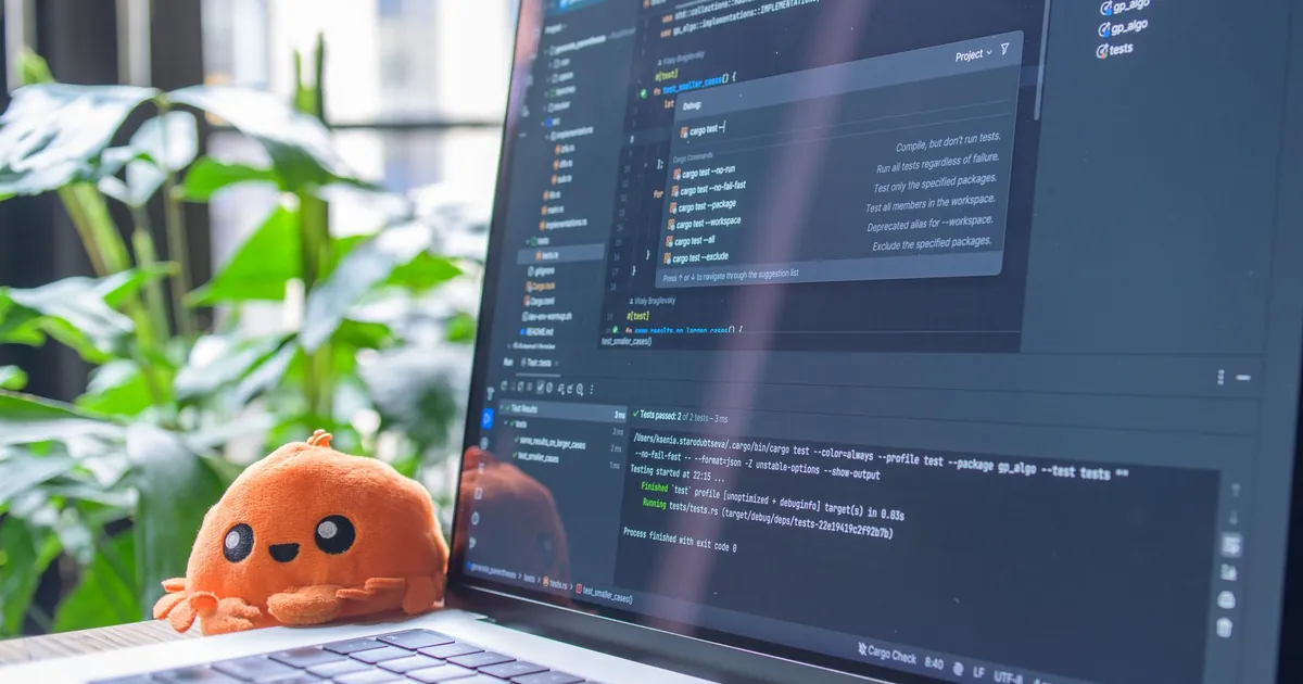
Here’s the short version: designing the user interface for a cybersecurity SaaS platform is a research-first process: interview the people who will actually log in, turn their jobs into wireframes and flows, test and revise with those users, then build to that spec so a password reset does not take three screens. Coloring between the lines is the last step, not the first.
Secure Techies does not ship a SOC product. We run cybersecurity for firms that buy those products, we build secure websites when that is the engagement, and we do web development for clients who need a site that will not fight their staff. This page is still worth writing because buyers in Los Angeles keep getting stuck in consoles that look impressive and fail at 2 a.m. If you are building a platform, this is the process worth copying. If you are buying one, this is the process you should demand evidence of.
The client’s four-step sequence is the right one. User research first. Blueprints second. Iterative tests third. Build to spec last. The rest of this page is how that sequence actually runs on a security product, where a buried button is delayed containment.
User research for a cybersecurity SaaS UI
Before a single pixel gets pushed, sit with the people who will use it. Managers. IT admins. The non-technical folks who still have to log in. This is not a box-tick. It is learning who really uses the platform, what slows them down, and what keeps them up at night.
Typical jobs we hear when we operate tools, not when we invent them:
- “I just want to reset a password without three screens.”
- “Tell me which laptop is encrypting files, in one click.”
- “Do not show me 400 informational alerts before the one that matters.”
- “The weekly PDF should match what I saw in the console yesterday.”
Nielsen Norman Group’s usability testing 101 is the method: a facilitator, realistic tasks, a participant who is a real user. Even a good designer cannot guess a modern interface into existence. The combinations of UI and human brain are too large. You watch.
For a security product, recruit the 2 a.m. user, not only the CISO who signed the PO. Ask what they did last Tuesday, not what they wish the product was. Last Tuesday is the truth.
Who to interview (and who to stop quoting)
Interview at least these four roles, even in a 25-person firm:
- The analyst or IT admin who will isolate a host
- The office manager who only needs a password reset or MFA recovery
- The manager who reads the weekly report and will call you if it disagrees with the console
- The after-hours person (often the same admin, or us) who will use the product half-asleep
Do not let the sales engineer stand in for those people. They will complete tasks they wrote. Non-technical users matter. If the product requires a security engineer for a routine lockout, adoption will die, and you will pay for a help desk that works around the UI.
NN/g’s well-known five-user guidance is for finding frequent problems in one round, then iterating. It is not a claim you are statistically done. Three small rounds beat one monster study. Security products have distinct user groups (analyst vs office manager). Test both. You do not need 15 people from each group. You need three or four from each, then a redesign, then another round.
Turning needs into blueprints
Once interviews show the pain (“too many unused buttons,” “I cannot find isolate”), you sketch wireframes and map user flows. This is the architectural stage. Everything gets tested for clarity before visual design makes it pretty and harder to kill.
Flows that belong on paper for a cybersecurity SaaS:
- Sign in, land on what needs me now, not a marketing dashboard.
- Open the top incident, see user + host + timeline, take the next action.
- Isolate a device, with an undo.
- Reset or revoke a session, with confirmation in plain language.
- Close as false positive so it stops paging.
- Export evidence for a customer or an insurer.
If a flow takes more than one primary screen plus a confirmation, write down why. “We have 14 widgets” is not a why.
Heuristics while you sketch
Jakob Nielsen’s 10 usability heuristics are a cheap inspection while you sketch:
- Visibility of system status: did isolate actually run?
- User control and freedom: can I undo?
- Error prevention: do not put “delete tenant” next to “delete filter.”
- Recognition rather than recall: show the hostname, do not make me remember it from three screens ago.
- Aesthetic and minimalist design: extra chrome hides the isolate button.
That last one is how security products get ugly and slow. Dark-mode SOC chrome is not a personality. If it hides the action, it is a defect.
NN/g’s error-message guidelines still apply: say what happened, in English, and what to do next. “Error 0x8004” is not a message. “Isolate failed: the agent on LAPTOP-FINANCE is offline. Open EDR or call the help desk” is a message.
Iterative design and feedback loops
Mockups are not sacred. Run new designs past actual users, gather blunt feedback, and refine. Repeat. If something is confusing now, it will stay confusing after launch, except now it has a version number and a training PDF nobody reads.
NN/g’s cheap three-day pattern still works: plan, test five users, turn findings into the next iteration. Remote moderated tests are fine. Do not test only with the engineering team.
Security-specific tests to run every round:
- Time-to-isolate a named laptop from a cold start
- Whether a non-admin can complete a password reset without a second person
- Whether error messages name the failure in English, not an internal code
- Whether dark-mode SOC chrome still meets contrast
- Whether the weekly report matches the console for the same incident
Time-to-isolate as a test, not a slogan
Write the acceptance test as a user job: “as an analyst, isolate host X in under 30 seconds from the incident.” Time it with a stopwatch in the usability session. If sales can only do it with a script, the product is not ready. Containment delayed by a maze is an incident-response failure wearing a design hat.
WCAG is the shared accessibility standard: perceivable, operable, understandable, robust, with testable success criteria at A, AA, AAA. AA is the procurement default. A keyboard trap on the incident graph is not a polish item. It is a blocked analyst.
Building to spec, not to guesswork
Once the design is locked, development mirrors it closely. Features are not skipped because they were hard. There is a tight loop between designers and engineers so the shipping product still has the details users called must-haves.
That is where many security vendors fail. The mockup had one-click isolate. The GA release has isolate buried under Device, then Actions, then a confirmation that uses a different hostname format. Analysts invent a runbook. The runbook drifts. The incident takes 20 minutes longer.
Spec means:
- Acceptance tests written as user jobs
- No shipping a page that was not in the last usability round without a reason
- A kill list for buttons nobody used in tests
- Help in context, not a 40-page PDF as the only documentation (heuristic 10)
If you are buying, ask for a recording of a usability session or a task-time number. If the vendor only has a brand deck, you are the test subject after go-live.
Error prevention is a security control
A UI that lets you isolate the wrong tenant, disable logging globally, or email a report that includes another customer’s data is not a UX nit. It is an incident. Confirmations should name the object in full. Dangerous actions should not share a layout with filters. Undo should exist for isolate whenever the product can reverse it.
That is heuristic 5 (prevent errors) and 9 (recover from them) applied to a SOC. We care because we are the people who get the call when someone clicked the wrong red button.
The same rule applies to high-converting landing pages: clarity beats decoration. A marketing site that hides the phone number wastes leads. A security console that hides isolate wastes minutes you do not have.
Accessibility is not a later patch
W3C’s ARIA Authoring Practices exist because custom widgets (charts, trees, infinite incident tables) regularly break keyboards and screen readers if you invent them from scratch. Use native HTML first. When you need a custom pattern, copy a tested one: name it, keyboard it, and do not trap focus.
For a cybersecurity SaaS console, accessibility failures show up as:
- Incident tables you cannot sort or open without a mouse
- Graphs with no text alternative for the spike
- Modals that steal focus and never give it back
- Contrast that fails in a dark SOC room
Procurement teams will ask. More importantly, your 2 a.m. user may be using a laptop with a failing trackpad. Keyboard-only has to work.
How buyers in a small firm should judge a console
You may never design a SaaS product. You will live in someone else’s.
In a demo, give them a real task from last month. Watch whether they can do it without a sales engineer driving. If the office manager cannot reset MFA without a script, the product is for engineers only. That might be fine. Do not pretend it is self-serve.
Compare this to our unified platform post: that page is the buying category. This post is why the category still fails when the UI is a junk drawer. A hub with six extra clicks per isolate is not unified. It is a new silo with a nicer gradient.
Questions worth asking in a vendor demo:
- Show me isolate on a named laptop from a cold login.
- Show me a false-positive close that actually stops the page.
- Show me the office-manager path for MFA reset.
- Show me a keyboard trip through the incident list.
- Show me last quarter’s usability-test notes, redacted if needed.
If they cannot produce 1 through 4, you are buying a slide. If they cannot produce 5, they are guessing.

The user drives the process
That is the client’s closer and it is the right one. A secure platform that people cannot operate is not secure in practice. Less friction, less confusion, better adoption: those are security outcomes, not just design slogans.
If you are building: research, wireframe, test, build to spec, test again.
If you are buying: demand that sequence, or budget training and a human who already knows the maze.
If you need the website or the Microsoft 365 admin experience to stop fighting your staff, that is work we actually do. Contact Secure Techies and bring the task that currently takes three screens.
Frequently Asked Questions